Responsive web design has become a prerequisite for every website in this internet age. Numerous features can get you a competitive edge in the web world, but responsiveness is a must for websites to win over the audience.
Since 2015, mobile users have steadily increased and even surpassed desktop users. Due to these changes, websites must have a highly responsive design. In fact! Google pushes websites with a mobile-friendly interface more.
Websites customized for only desktop users suffer a huge risk of bounce rate. Before going further on the importance of responsive web design, let’s understand its meaning.
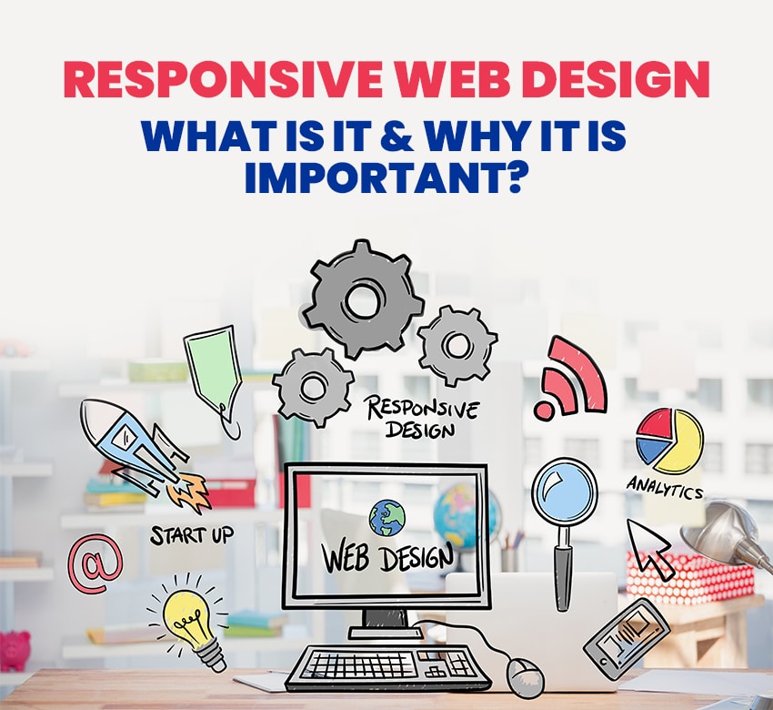
What is Responsive Web Design?
Responsive web design enables fluid and flexible layouts in different devices to match the contents with their respective screen sizes.
In simple terms, a website can respond and resize itself according to the device’s screen on which it is viewed like laptop, tablet, mobile phone, etc.
This feature gives an excellent user experience, removes the irritating resizing and zooming of a non-responsive webpage, and helps users to navigate seamlessly across the platform.
Importance of Responsive Web Design:
Enhanced SEO
Having a responsive website helps you to get an improved search engine ranking. Google wants to give its users the best experience and therefore attempts to show only those highly responsive websites.
If you are not concerned about this factor in your web design, your ranking will automatically drop so, if you want your SEO and traffic to escalate, make responsive web design a sure deal.
Better User-experience
The most important aspect of your website is traffic and customer retention. Nothing can stop you from making loads of profit if your UX is taken care of. Making your website mobile-friendly or responsive to multiple devices will give a positive experience to your users.
Visitors love the scalable web designs and allow them easy access to menus and buttons without confusion. If your website is loose on the responsive factor and visitors have to zoom in and out constantly, they won’t take much time to leave it.
Helps in Cost-cutting
It can be expensive to maintain two separate websites for mobile and desktop audiences. But if you are focusing on increasing the responsive aspect of your website, then you won’t need two of them.
You will be good to go with a single website and save a lot of money. Additionally, a responsive website is easier to maintain and operate than two different versions of a non-responsive one.
Faster Website Speed
According to research, people are likely to abandon a webpage if it takes more than 3 seconds to load content. With the vast amount of content available online, nobody has the time to wait for a slow website.
But if you own a responsive website, it will load much faster no matter which device is used to access it. All of this is possible due to the responsive images and fluid grid that loads quickly and offers visitors a smooth interaction.
Best way to get a responsive web design? Ask the experts of Planet Web Solutions for help! We are a leading eCommerce web design company in India and got an expert team of experienced web developers and designers.