Introduction
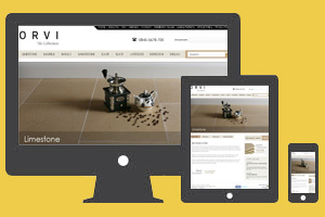
Responsive web design is a technique to build web pages that alter their look according to the device using CSS3 media queries.
That is, there is only one HTML code for the page regardless of the device accessing it, CCS media queries specifies the CSS rules to apply according to the browser.
Benefits of using Responsive Web Design
You may or may not be familiar with the concept of responsive web design, but one thing you should be aware of is that your website should serve the needs of the growing number of customers who use devices other than the computer to access the internet.
Responsive web design allows for optimal view of your website across all devices. Top advantages of using responsive web design are as follows:
- With responsive web design you’ll be making your website accessible to people 24/7. Lots of your customers will constantly be on the move. In fact, this is the major reason why people are turning towards mobile devices to access the web.
- Websites meant for mobile devices are usually very Spartan and do not have advanced navigational features, such as in websites for computers. Your customers do not want to waste time in looking for features in a poorly designed mobile website. They’d rather go over to competitor’s website. Responsive web design helps you to prevent such a scenario by converting computer site to mobile site and thus provide rich functionalities to users.
- Search Engine Optimization (SEO) is another great reason to go for responsive web design. If you have a separate website for mobile devices then you have to deal with issues of duplicity between computer and mobile site, issues of canonicalization etc. Using responsive web design, you can easily get rid of SEO problems arising on your website.
Core Elements
Responsive web design is built around three main elements. They are:
- Fluid grids,
- Fluid images, and
- Media Queries
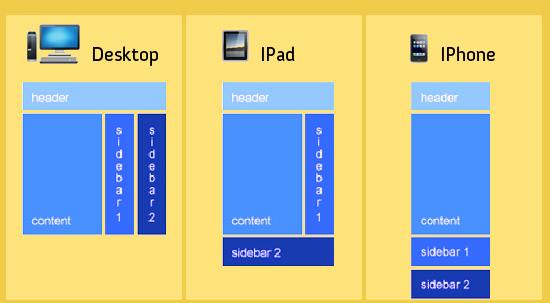
Consider the media queries
It works as below:
Media Queries for desktop, iPhone and iPad
You have to consider the way your layout is going to be, by thinking of the platform you design for. The main problem on the internet today is that most of the designers and developers do not think of queries other than desktop. Using responsive web design, you can improve your conversions and help improve the web.

